Flutter——常用布局
Flutter—常用布局
- 效果图
- widget 树形图
- 左布局
- Text
- 评分条
- 提示内容
- 右布局
- 应用
- Stack布局
- 效果图
- 释
- 示例
- 效果图
- 释
- 电影封面
- 电影信息
- 电影演员
- 电影简介
- 应用
效果图
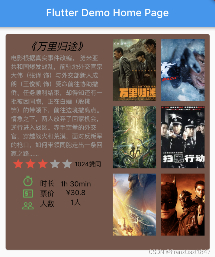
widget 树形图
整个界面由一行组成,分为两列;左列包括电影介绍,由上到下垂直排列;右列由GridView布局组成3行2列的效果

左布局
将每一部分定义成一个变量,然后通过调用变量,减少层级嵌套,避免编码时视觉混乱;左边部分分为四个部分:标题,内容,评分条,提示。其中评分条,和提示由化为多个子组件
 var leftColumn = Container(
   padding: const EdgeInsets.all(10.0),
   child: Column(
     children: [
       defaultText(20.0, Colors.black, "《万里归途》", FontStyle.italic),
       defaultText(12.0, Colors.grey, movieContent, FontStyle.normal),
       rating,
       tips
     ],
   )
 );
Text
将Text组件定义成一个方法,在内容差不多的情况下,可以减少层级,使用时,就调用方法,然后获取返回Text即可,因为Flutter和原生Android存在差距,并不需要声明组件ID,所以很多时候可以通过某些方法,减少重复编写。
defaultText(20.0, Colors.black, "《万里归途》", FontStyle.italic),
Text defaultText(double textSize,Color textColor,String content,FontStyle fontStyle){
   return Text(
     content,
     style: TextStyle(
       fontSize:  textSize,
       color: textColor,
       fontStyle: fontStyle,
     ),
   );
评分条
评分条由一行两列组成,左列为星星组成,右列由Text组成
  final rating = Row(
    mainAxisAlignment: MainAxisAlignment.spaceEvenly,
    crossAxisAlignment: CrossAxisAlignment.center,
    children:<Widget> [
      stars,
      defaultText(12.0, Colors.black, "1024赞同", FontStyle.normal)
    ],
  );
评分星星久直接使用Row布局排列即可,可以使用其内置图标,其中mainAxisSize: MainAxisSize.min代表按照其大小自适应排列
 var stars = Row(
   mainAxisSize: MainAxisSize.min,
   children: const [
     Icon( Icons.star, color: Colors.red),
     Icon( Icons.star, color: Colors.red),
     Icon( Icons.star, color: Colors.red),
     Icon( Icons.star, color: Colors.grey),
     Icon( Icons.star, color: Colors.grey)
   ],
 );
提示内容
提示内容列由Container包裹,其中Container带表单布局,其意为只需有一个组件存在,然后又划分为3行3列,顾名思义,Row为横向排列,Column为纵向排列,这俩布局在日常开发中,使用较多
final tips = Container(
  padding: const EdgeInsets.all(10),
  child: Row(
    mainAxisAlignment: MainAxisAlignment.spaceEvenly,
    children: [
      Column(
        children: const [
          Icon(Icons.timer_outlined,color: Colors.green),
          Icon(Icons.price_change_outlined,color: Colors.green),
          Icon(Icons.people_outline,color: Colors.green)
        ],
      ),
      Column(
        children: [
          defaultText(14.0, Colors.black, "时长", FontStyle.normal),
          defaultText(14.0, Colors.black, "票价", FontStyle.normal),
          defaultText(14.0, Colors.black, "人数", FontStyle.normal)
        ],
      ),
      Column(
        children: [
          defaultText(14.0, Colors.black, "1h 30min", FontStyle.normal),
          defaultText(14.0, Colors.black, "¥30.8", FontStyle.normal),
          defaultText(14.0, Colors.black, "1人", FontStyle.normal)
        ],
      )
    ],
  )
);
右布局
右列主要应用GridView布局,通过插入图片内容,形成一个3行2列布局形式
| GridView属性 | 释义 |
|---|---|
| crossAxisCount | 列数 |
| mainAxisSpacing | 行间距 |
| crossAxisSpacing | 列间距 |
| childAspectRatio | 宽高比 |
 var rightColumn = Container(
     padding: const EdgeInsets.all(10.0),
     child:GridView(
       gridDelegate: const SliverGridDelegateWithFixedCrossAxisCount(
         crossAxisCount: 2,
         mainAxisSpacing: 10.0,
         crossAxisSpacing: 10.0,
         childAspectRatio: 0.7,
       ),
       children: [
         Image.network('https://puui.qpic.cn/vcover_vt_pic/0/mzc00200qv892j31664769964603/260', fit: BoxFit.cover),
         Image.network('https://puui.qpic.cn/vcover_hz_pic/0/mzc0020081yfj601667638704638/0', fit: BoxFit.cover,),
         Image.network('https://puui.qpic.cn/vcover_hz_pic/0/mzc00200dxhbjfd1666584195007/0', fit: BoxFit.cover,),
         Image.network('http://img21.mtime.cn/mt/2010/07/02/161110.98639415_1280X720X2.jpg', fit: BoxFit.cover,),
         Image.network('https://puui.qpic.cn/vcover_hz_pic/0/mzc00200mjy32e71663670004536/0', fit: BoxFit.cover,),
         Image.network('https://puui.qpic.cn/vcover_hz_pic/0/mzc00200977rx4h1665298676133/0', fit: BoxFit.cover,),
       ],
     )
 );
应用
最后在body中引用左右俩布局即可,其中Card为卡片布局,可以生成一个圆角矩形的背景,可以通过其color属性更改,背景颜色
 body: Container(
          padding: const EdgeInsets.all(10.0),
          height: 450,
          alignment: Alignment.center,
          child: Card(
            color: Colors.brown,
            clipBehavior: Clip.antiAlias,
            child: Row(
              mainAxisAlignment: MainAxisAlignment.spaceEvenly,
              crossAxisAlignment: CrossAxisAlignment.start,
              children:[
                Expanded(child: leftColumn),
                Expanded(child: rightColumn)
              ],
            ),
          ),
        )
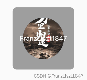
Stack布局
效果图
释
官方解释如下:
- 用于覆盖另一个 widget
- 子列表中的第一个 widget 是基础 widget;后面的子项覆盖在基础 widget 的顶部
- Stack 的内容是无法滚动的
- 你可以剪切掉超出渲染框的子项
简单说,就是应用Stack布局,其中的子布局会层叠在一起
下列列出三个子组件,一个为背景、一个为图像、一个为名称,效果如上图所示
var buildStack = Stack(
  alignment: Alignment.center,
  children: [
    Container(
      width: 150.0,
      height: 150.0,
      decoration: const BoxDecoration(
          gradient: LinearGradient(colors: [Colors.grey, Colors.grey]),
          shape: BoxShape.rectangle,
          borderRadius: BorderRadius.all(Radius.circular(10.0))),
    ),
    const CircleAvatar(
      backgroundImage: NetworkImage(
          'https://puui.qpic.cn/vcover_vt_pic/0/pxehhgycon4rixh1664499664/260'),
      radius: 50,
    ),
    const Text(
      'FranzLiszt1847',
      style: TextStyle(fontSize: 16.0, color: Colors.white),
    ),
  ],
);
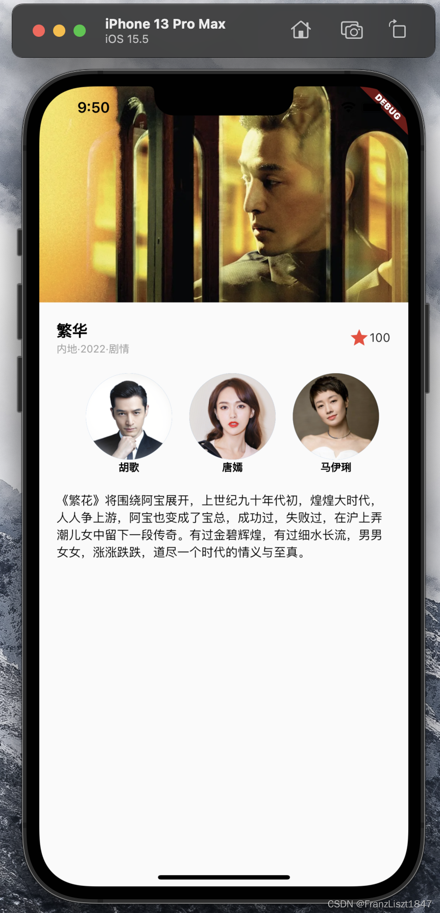
示例
效果图
释
父布局为Column布局,形成一个4行1列的布局,分为:电影封面、电影信息、电影演员、电影简介四个部分
电影封面
封面较为简单,直接将图片装进一个盒子里面,并赋于大小即可
var bg = SizedBox(
  height: 250.0,
  child: Image.network('https://puui.qpic.cn/vcover_hz_pic/0/mzc00200whsp9r61623030200228/0',fit: BoxFit.cover),
);
电影信息
分为左右两部分,左边又分为上下两部分,为了让左边和右边有足够多的空间,让左边被Expanded布局包裹,即左边默认权重是1,那么右边就自适应内容大小,其余空间被左边占据
var title = Container(
  padding: const EdgeInsets.all(20.0),
  child: Row(
    children: [
      Expanded(
        child: Column(
          crossAxisAlignment: CrossAxisAlignment.start,
          children: [
            defaultText(18.0, Colors.black, "繁华", FontStyle.normal,FontWeight.bold),
            defaultText(12.0, Colors.grey, "内地·2022·剧情", FontStyle.normal,FontWeight.normal)
          ],
        ),
      ),
      const Icon(Icons.star, color: Colors.red),
      const Text('100')
    ],
  ),
);
电影演员
因为有三个演员,每一个演员是一列,用一个公共方法包裹,然后复用即可
Container getActList(String actor,String url){
  return Container(
    margin: const EdgeInsets.only(left: 20.0),
    child: Column(
      mainAxisSize: MainAxisSize.min,
      children: [
        CircleAvatar(
          backgroundImage: NetworkImage(url),
          radius: 50,
        ),
        defaultText(12.0, Colors.black, actor, FontStyle.normal,FontWeight.bold)
      ],
    ),
  );
}
采用 mainAxisSize: MainAxisSize.min,属性让三个演员自适应大小,然后外面使用Row布局进行包裹,最终形成2航3列的效果
var actors = Row(
  mainAxisSize: MainAxisSize.min,
  mainAxisAlignment: MainAxisAlignment.spaceEvenly,
  children: [
    getActList('胡歌','https://puui.qpic.cn/vstar_pic/0/name_77904_688t1467970955.jpg/0?max_age=7776000'),
    getActList('唐嫣','https://puui.qpic.cn/media_img/0/null1515833526/0?max_age=7776000'),
    getActList('马伊琍','https://puui.qpic.cn/media_img/0/801701537252577/0?max_age=7776000')
  ],
);
电影简介
直接给予一个Container布局,申明一个外边距即可
var introduction = '《繁花》将围绕阿宝展开,'
    '上世纪九十年代初,煌煌大时代,'
    '人人争上游,阿宝也变成了宝总,成功过,失败过,在沪上弄潮儿女中留下一段传奇。'
    '有过金碧辉煌,有过细水长流,男男女女,涨涨跌跌,道尽一个时代的情义与至真。';

var brief = Container(
  margin: const EdgeInsets.all(20.0),
  child: defaultText(14.0, Colors.black, introduction, FontStyle.normal,FontWeight.normal),
);
应用
最后将申明的四个部分使用Column布局包裹即可
      body: Column(
        children: [
          bg,
          title,
          actors,
          brief
        ],
      )