Pandas数据处理可视化
Hallo,各位小伙伴大家好啊!这个专栏是用来分享数据处理以及数据可视化的一些常见操作,以及自己的一些学习笔记,希望能给大家带来帮助呀!感兴趣的小伙伴也欢迎私信或者评论区交流呀!
以下可视化的数据来源为“transcript.xlsx”成绩单文件,他有六列,分别是学生姓名、班级、数学科目得分、体育科目得分、python语言得分、美学科目得分。基于这个数据表,进行数据处理和可视化操作。

一、垂直柱形图
柱形图,又称长条图、柱状统计图亦称条图条状图、棒形图,是一种以长方形的长度为变量的统计图表。长条图用来比较两个或以上的价值(不同时间或者不同条件),只有一个变量,通常利用于较小的数据集分析。长条图亦可横向排列,或用多维方式表达。
代码如下:
import pandas as pd            #导入pandas库
import matplotlib.pyplot as plt
import numpy as np
plt.rcParams['font.sans-serif']=['SimHei']
plt.rcParams['axes.unicode_minus']=False

excel_file = 'transcript.xlsx'        #导入文件
data = pd.read_excel(excel_file)      #读入数据

def func(type):
    type_class = data.loc[data['class'] == type]
    class_math = type_class["math"]
    class_physics = type_class["physics"]
    class_python = type_class["python"]
    class_aesthetics = type_class["aesthetics"]
    type_dic = {}
    type_dic["math"] = sum(class_math)/len(class_math)
    type_dic["physics"] = sum(class_physics)/len(class_physics)
    type_dic["python"] = sum(class_python)/len(class_python)
    type_dic["aesthetics"] = sum(class_aesthetics)/len(class_aesthetics)
    return type_dic

dic_A = func("A")
dic_B = func("B")
dic_C = func("C")
dic_D = func("D")
y1 = list(dic_A.values())
y2 = list(dic_B.values())
y3 = list(dic_C.values())
y4 = list(dic_D.values())
x = np.arange(len(y1))

#设置柱状图的宽度
width = 0.1
#绘图
plt.figure(figsize=(8,4))
plt.bar(x=x,height=y1,width=width,label='math')
plt.bar(x=x+width,height=y2,width=width,label='physics')
plt.bar(x=x+2*width,height=y3,width=width,label='python')
plt.bar(x=x+3*width,height=y4,width=width,label='aesthetics')
plt.xlabel('平均成绩')
plt.ylabel('班级')

#添加图标题和图例
a = [0,1,2,3]
labels = ['A', 'B', 'C', 'D']
plt.xticks(a,labels,rotation = 30)
plt.title('各个班级四个科目平均成绩垂直柱形图')
plt.legend(bbox_to_anchor=(0.1, 1))
plt.show()
效果如下:

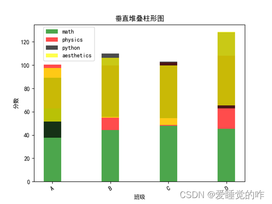
二、垂直堆叠柱形图
垂直堆叠柱状图是柱状图的一种,可以在较小的可视化应用空间内,智能地展示多维的数据差异。支持自定义y轴区间、多系列数据配置以及堆叠式的数据展示。
代码如下:
import pandas as pd            #导入pandas库
import matplotlib.pyplot as plt
import numpy as np
plt.rcParams['font.sans-serif']=['SimHei']
plt.rcParams['axes.unicode_minus']=False

excel_file = 'transcript.xlsx'        #导入文件
data = pd.read_excel(excel_file)      #读入数据

def func(type):
    type_class = data.loc[data['class'] == type]
    class_math = type_class["math"]
    class_physics = type_class["physics"]
    class_python = type_class["python"]
    class_aesthetics = type_class["aesthetics"]
    type_dic = {}
    type_dic["math"] = sum(class_math)/len(class_math)
    type_dic["physics"] = sum(class_physics)/len(class_physics)
    type_dic["python"] = sum(class_python)/len(class_python)
    type_dic["aesthetics"] = sum(class_aesthetics)/len(class_aesthetics)
    return type_dic

dic_A = func("A")
dic_B = func("B")
dic_C = func("C")
dic_D = func("D")
y1 = list(dic_A.values())
y2 = list(dic_B.values())
y3 = list(dic_C.values())
y4 = list(dic_D.values())
y_list = [y1,y2,y3,y4]
x = np.arange(len(y1))
width = 0.1
plt.xlabel('班级')
plt.ylabel('分数')
def push(i):
#设置柱状图的宽度
    if i == 0:
        plt.bar(x[i], y_list[i][0], alpha=0.7, width=0.3, color='green',label = "math")
        plt.bar(x[i], y_list[i][1], alpha=0.7, width=0.3, color='red',bottom=y_list[i][0],label = "physics")
        plt.bar(x[i], y_list[i][2], alpha=0.7, width=0.3, color='black',bottom=y_list[i][1],label = "python")
        plt.bar(x[i], y_list[i][3], alpha=0.7, width=0.3, color='yellow',bottom=y_list[i][2],label = "aesthetics")
    else:
        plt.bar(x[i], y_list[i][0], alpha=0.7, width=0.3, color='green')
        plt.bar(x[i], y_list[i][1], alpha=0.7, width=0.3, color='red', bottom=y_list[i][0])
        plt.bar(x[i], y_list[i][2], alpha=0.7, width=0.3, color='black', bottom=y_list[i][1])
        plt.bar(x[i], y_list[i][3], alpha=0.7, width=0.3, color='yellow', bottom=y_list[i][2])
push(0)
push(1)
push(2)
push(3)

a = [0,1,2,3]
labels = ['A', 'B', 'C', 'D']
plt.xticks(a,labels,rotation = 30)
plt.legend(bbox_to_anchor=(0.30, 0.75))
plt.title('垂直堆叠柱形图')
plt.show()
效果如下:
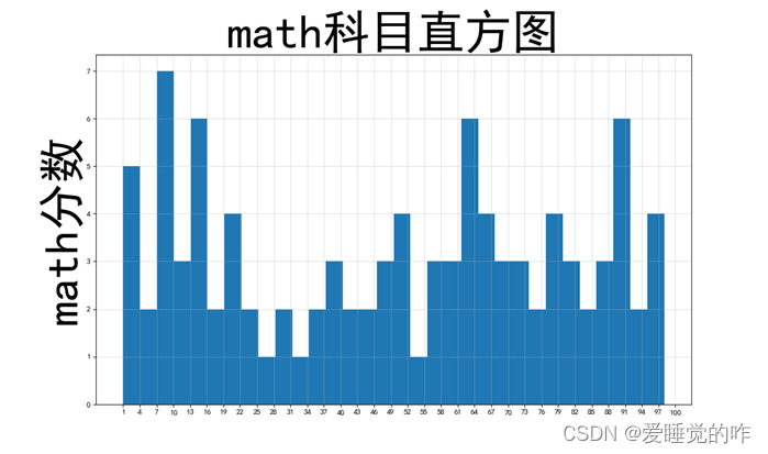
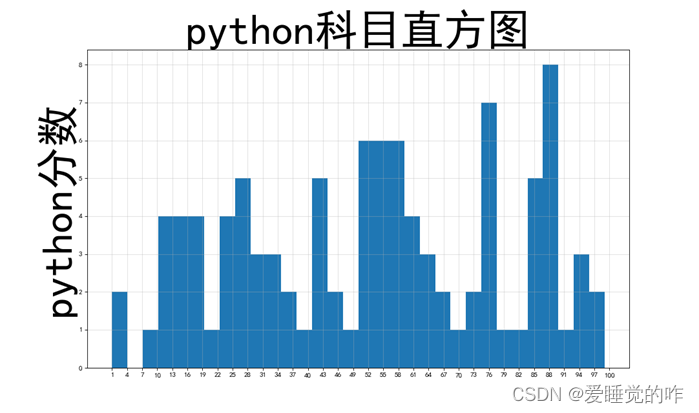
三、直方图
直方图又称质量分布图,是一种统计报告图,它是根据具体数据的分布情况,画成以组距为底边、以频数为高度的一系列连接起来的直方型矩形图。
代码如下:
import pandas as pd            #导入pandas库
import matplotlib.pyplot as plt
import numpy as np
plt.rcParams['font.sans-serif']=['SimHei']
plt.rcParams['axes.unicode_minus']=False

excel_file = 'transcript.xlsx'        #导入文件
data = pd.read_excel(excel_file)      #读入数据
math = data["math"]
physics = data["physics"]
python = data["python"]
aesthetics = data["aesthetics"]

# 计算组数
def histo(a,subject):
    d = 3  # 组距
    num_bins = (max(a) - min(a)) // d
    # 设置图形大小
    plt.figure(figsize=(20, 8), dpi=80)
    plt.hist(a, num_bins)
    # 设置x轴刻度
    plt.xticks(range(min(a), max(a) + d, d))
    # 设置网格
    plt.grid(alpha=0.4)
    plt.ylabel(subject+"分数",fontsize=60)
    plt.title(subject+"科目直方图",fontsize=60)
# print(math)
histo(math,"math")
histo(physics,"physics")
histo(python,"python")
histo(aesthetics,"aesthetics")
plt.show()
效果如下:


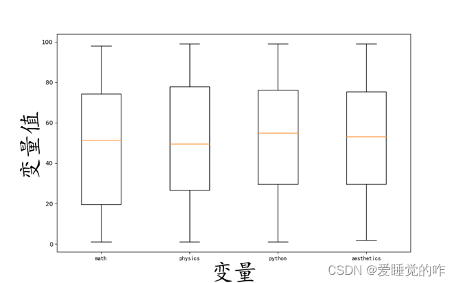
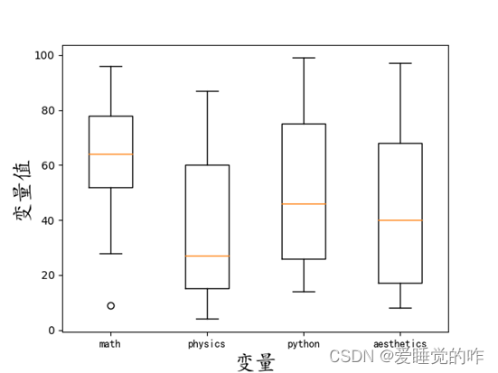
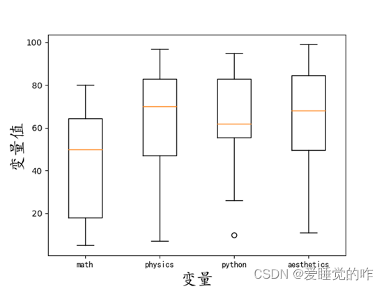
四、分布箱线图
箱线图是用来表示一组或多组连续型数据分布的中心位置和散布范围的图形,因形似箱子故取名为箱线图。
代码如下:
按各个科目的分数分布箱线图:
import pandas as pd
import matplotlib.pyplot as plt

# 读取excel文件
file_01 = pd.read_excel("transcript.xlsx")

fig = plt.figure(figsize=(16, 8))
d1 = file_01['math']
d2 = file_01['physics']
d3 = file_01['python']
d4 = file_01['aesthetics']

label = 'math', 'physics', 'python', 'aesthetics'
plt.boxplot([d1, d2, d3, d4], labels=label)  # label设置横轴每个箱图对应的横坐标
plt.xticks(fontproperties='KaiTi')
plt.xlabel('变量', fontproperties='KaiTi',fontsize=40)
plt.ylabel('变量值', fontproperties='KaiTi',fontsize=40)
plt.show()
按班级的科目分数分布箱线图:
import pandas as pd
import matplotlib.pyplot as plt

# 读取excel文件
data = pd.read_excel("transcript.xlsx")
def func(type):
    type_class = data.loc[data['class'] == type]
    d1 = type_class["math"]
    d2 = type_class["physics"]
    d3 = type_class["python"]
    d4 = type_class["aesthetics"]
    label = 'math', 'physics', 'python', 'aesthetics'
    plt.boxplot([d1, d2, d3, d4], labels=label)  # label设置横轴每个箱图对应的横坐标
    plt.xticks(fontproperties='KaiTi')
    plt.xlabel('变量', fontproperties='KaiTi', fontsize=20)
    plt.ylabel('变量值', fontproperties='KaiTi', fontsize=20)
    plt.show()
func("A")
func("B")
func("C")
func("D")
效果如下:


五、总结
- Pandas对数据进行筛选,比如说绘制各个班级四个科目平均成绩的垂直柱形图时,需要对不同班级进行筛选,则利用pandas中的type_class = data.loc[data['class'] == type],进行筛选,这里的type即是班级种类ABCD。
- 函数封装思想,在整个编程中,运用了蕴含了大量自己封装的函数,因为在画图中有很多重复的操作,比如说画不同科目的直方图时,仅是科目类别对应的数据不一样,代码逻辑和框架是一样的。运用函数封装使得代码更加啊清晰,高效,也能够减少代码量。
- 用字典存储对应数据。type_dic = {},键是不同的科目名,键是平均成绩。这样在画图时,键可以作为图列,y1 = list(dic_A.values()),取得y值绘图。
- plt.rcParams['font.sans-serif']=['SimHei'] plt.rcParams['axes.unicode_minus']=False 防止中文标签标题等不能正常显示。
- 导入文件,读取数据的相关操作:excel_file = 'transcript.xlsx'#导入文件data = pd.read_excel(excel_file) #读入数据
- 绘制垂直堆叠柱形图时,plt.bar()中注意设置bottom参数是从上一个科目上开始的,这样才能够达到堆叠的效果。
- 绘制各个科目的直方图时,设置了一个d组距,将最大值减去最小值除以组距作为num_bins,用plt进行画图,设置网格使效果更加直观。绘制各个科目的分数分布箱线图,label = 'math', 'physics', 'python', 'aesthetics'设置横轴每个箱图对应的横坐标